|
Screen Editor |
  
|
|
Screen Editor |
|
Overview
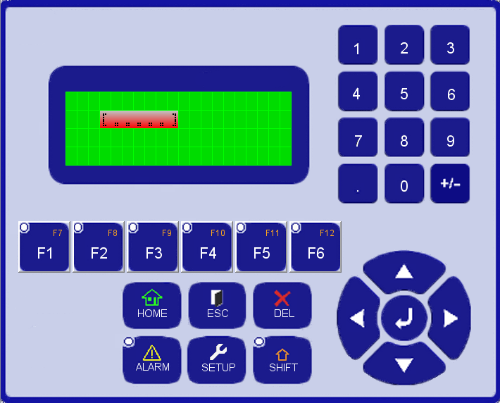
The screen editor allows the user configuring the screens by adding and removing components, so that values will be read and written in the program or showed on the display of the device.
The editor has function keys that allow browsing the screens or manipulating bits. A level of access can be configured for each screen, so that only authorized users will see the content.
|
NOTE! The PLC300 allows editing at most 512 screens. |
The components used to edit the screens are the following:
 Bargraph: Shows the value of a variable graphically;
 Text: Shows the text on the screen;
 Numeric Input: Enters numeric values in a variable;
 Numeric Output: Shows the numeric value of a variable;
 Message: Shows configured texts on a table, selected by means of an index;
 Text Input: Enters variables values in ASCII code;
 Text Output: Shows variable values in ASCII code.
Function Keys
The browsing of screens and the manipulation of bits are done by means of the configuration of the function keys.
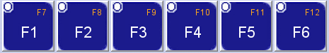
The options available to configure the keys are the following:
| • | None: This function key will not execute any actions; |
| • | Bit: Selects one of the functions of bit manipulation; |
| • | Screen: Selects one key for browsing. |
Bit Manipulation
The bit manipulation function allows turning a Boolean variable on, off, inverting its status or turning it off temporarily.
The options available for selection are the following:
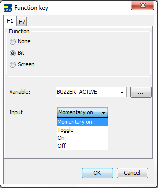
| • | MomentaryOn: Turns on a selected Boolean variable (writes value 1) while the key is pressed. When you release the key, the marker returns to zero. |
| • | Toggle: Inverts the status of the selected Boolean variable; |
| • | On: Turns on a selected Boolean variable (writes value 1); |
| • | Off: Turns off a selected Boolean variable (writes value 0). |
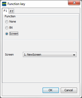
Browsing of the Screens
The browsing through the screens is done by means of the edition of the Screen option.
In the example below, screen 2 will be accessed when F1 key is pressed.
Passwords and levels of access
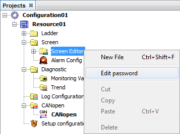
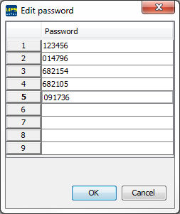
The PLC300 has ten password levels (0 - 9). Level zero (default value) is chosen when you wish free access to the screen. Except for the zero screen (Home), which always has zero access level, the other screens can be set with an access level. The password configuration window is opened when the options of the Screen editor folder are selected.
The configured passwords must have six decimal characters.
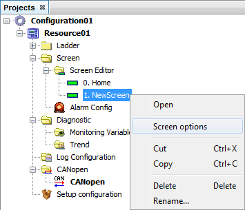
In order to configure the screen access level, it is necessary to configure this option in the screen options.
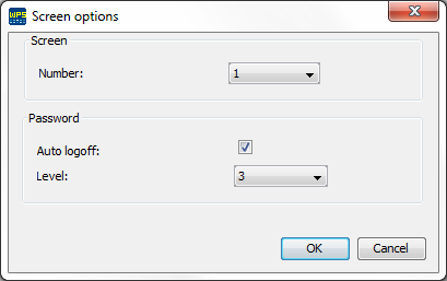
Screen options
In the screen options, you can configure the current screen number and the properties of the screen password. In order to open those options, it is necessary to select the options of the screen file in the resource.
The screen options are the following:
| • | Auto Logoff: When a screen with access level is viewed, if the access level of the screen is higher than the current level, the device access level becomes the same as the current screen level. If the auto logoff option is enabled, after the access to the screen, the device access level will not change. |
| • | Level: Selects the screen access level. The higher the level of access, the greater the privilege. Up to nine access levels can be programmed to allow different kinds of users accessing certain screens. Zero access level means that the screen will not require a password in order to be accessed. |
Screen edition
The screens are composed of components, such as Bargraph, Numeric Input, Numeric Output, Text, Message and Text Output. For the setting of the screens, the components are entered in the display by dragging the components from the pallete to the display or by right clicking the mouse on the display.
The components used to edit the screens are the following:
Bargraph
The Bargraph component shows a bargraph on the display with block-type characters proportional to the value of the selected variable.
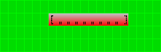
The properties of this component are:
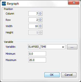
| • | Variable: Variable used to display the bargraph. |
| • | Maximum: Maximum value shown by the graph. In case the value of the variable is equal to or above the maximum value, the graph is displayed with the all bars completely filled. |
| • | Minimum: Minimum value shown by the graph. In case the value of the variable is equal to or below the minimum value, the graph will not show any bars filled. |
Numeric Input
The Numeric Input component allows the user entering a numeric value within a certain range. The entered content is stored in a variable.
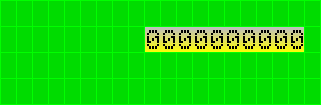
The properties of this component are:
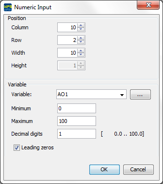
| • | Variable: Variable used to enter data in the display; |
| • | Maximum: Maximum value accepted as input for this field. In case the entered value is higher than this value, the maximum value will be assigned; |
| • | Minimum: Minimum value accepted as input for this field. In case the entered value is higher than this value, the minimum value will be assigned; |
| • | Decimal digits: Number of decimal places in the presentation of the variable on the display; |
| • | Leading zeros: Fills with zeros the spaces that are empty between the configured component length and the variable size. |
Numeric Output
The Numeric Output component presents the formatted value (decimal places, leading zeros or flashing) of the variable selected on the display.
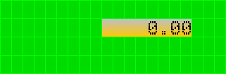
The properties of this component are:
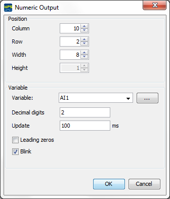
| • | Variable: Variable used to present the data on the display; |
| • | Decimal digits: Number of decimal places in the presentation of the variable on the display; |
| • | Update: Time (in milliseconds) used for the update of the field on the display. This value is only an approximated value, since is depends on the scan of the device; |
| • | Leading zeros: Fills with zeros the spaces that are empty between the configured component length and the variable size; |
| • | Blink: Enables the option of blinking text. |
Text
The Text component is used to insert fixed texts in the screen.
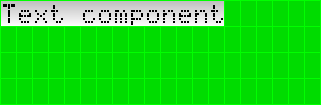
The properties of this component are:
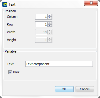
| • | Text: Text displayed on the screen; |
| • | Blink: Enables the option of blinking text. |
Message
The Message component shows configured texts on a table, selected by means of an index.

The properties of this component are:
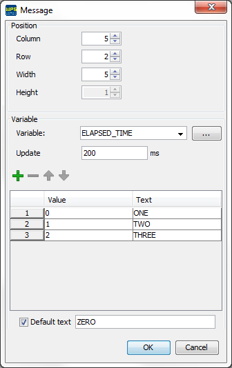
| • | Variable: Variable used as index to display the text on the screen; |
| • | Update: Time (in milliseconds) used for the update of the field on the display. This value is only an approximated value, since is depends on the scan of the device; |
| • | Table |
| o | Value: Table index; |
| o | Text: Text displayed when the variable value is equivalent to the table index; |
| o | Default text: Text displayed when the variable assumes a value not set in column value. When this option is disabled the displayed text is the variable value. |
Text Output
The Text component displays configurable texts for values of a variable.
The properties of this component are:
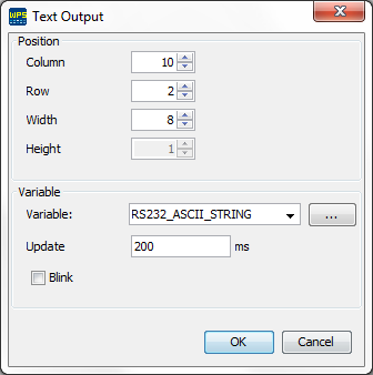
| • | Variable: STRING type variable containing the text; |
| • | Update: Time (in milliseconds) used for the update of the field on the display. This value is only an approximated value, since is depends on the scan of the device; |
| • | Blink: Enables the option of blinking text. |
|
NOTE! A BYTE variable was used instead of STRING in firmware versions below 2.10. The array size was defined by the component size. |
Text Input
The Text Input component allows the user to enter text;
The properties of this component are:
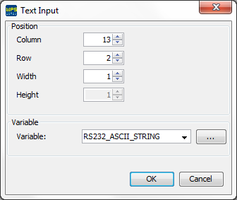
| • | Variable: STRING type variable used as storage for the text entered. |
|
NOTE! A BYTE variable was used instead of STRING in firmware versions below 2.10. The array size was defined by the component size. |